How to Create Chart From Dataframe With Column as Filter in Python
To create a chart from a dataframe with a column as a filter in Python, you can use the matplotlib library.
The following example shows how to create a chart from a dataframe with a column as a filter in Python using the matplotlib library.
Using matplotlib Library
We can use the matplotlib library to create a chart from a dataframe with a column as a filter.
Let’s see how to use the matplotlib library in Python:
# Import libraries
import pandas as pd
import matplotlib.pyplot as plt

# Create dataframe
office_stuff = pd.DataFrame({
    'Date': ['01-03-2023', '01-03-2023', '01-03-2023', '01-03-2023', '02-03-2023', '02-03-2023'],
    'Product_Code': ['A-101', 'A-102', 'A-103', 'B-101', 'B-102', 'B-104'],
    'Product_Name': ['Laptop', 'Mobile', 'Printer', 'Keyboard', 'Scanner', 'Mouse'],
    'Price': [4500, 550, 250, 50, 350, 50],
    'Status': [1, 1, 1, 0, 1, 1]
})

# Filter data where Status is 1
filtered_data = office_stuff[office_stuff['Status'] == 1]

# Group data by Product_Name
grouped = filtered_data.groupby('Product_Name')['Price'].sum().reset_index()

# Create bar plot
plt.bar(grouped['Product_Name'], grouped['Price'])
plt.title('Product Prices with Status 1')
plt.xlabel('Product Name')
plt.ylabel('Price')
plt.show()
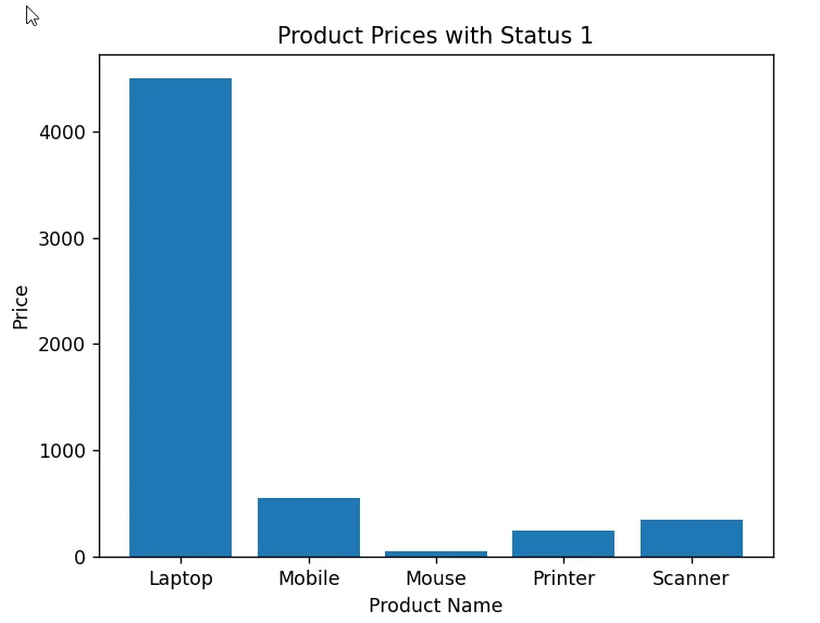
Output: 👇️

In this example, we filter the dataframe office_stuff to include only rows where the Status column is 1.
We then group the filtered data by Product_Name and sum the Price column.
Finally, we use the plt.bar() function to create a bar chart from the grouped data. The output shows the bar chart created from the filtered dataframe.
Conclusion
We can use the matplotlib library to create a chart from a dataframe with a column as a filter in Python.